Support for CSS grid layout landed in Firefox 52.0, released on March 6, 2017 after years of effort. Firefox was the first major browser to ship grid support, though Chrome followed very quickly after. To promote Firefox to web developers we created a page showcasing what can be done with CSS grid, along with links to developer resources to learn more about it.
Of course, I had to learn CSS grid layout myself in order to build a page about CSS grid layout, so that was fun. I confess I continued to refer to the page for a long time afterward to remind myself of different syntax bits every time I did anything with grid. This page turned out not to just be a nice demo of a new CSS standard, but a useful educational resource.
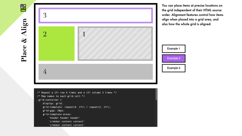
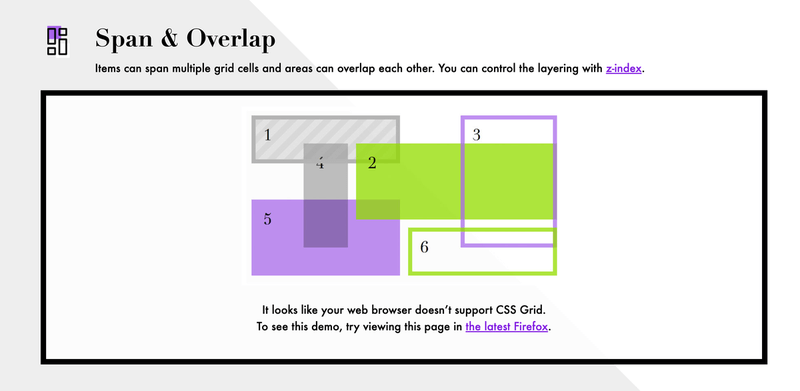
At the time, grid layout was only supported in the latest version of Firefox,
and other browsers didn’t fully support it at all yet, so the page also needed
to degrade gracefully in non-grid browsers that couldn’t show the live examples.
The page is progressively enhanced with liberal application of @supports
and older browsers get screenshots of what they’re missing.
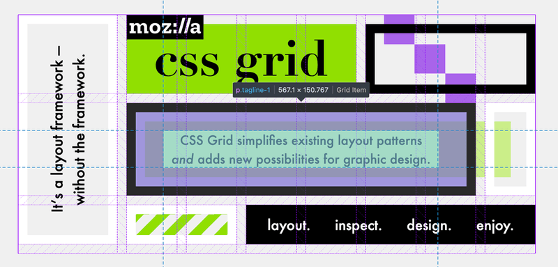
The fancy geometric header is itself built with CSS grid with a handful of presentational elements to render some of the decorative blocks.
The page is responsive but optimized for larger viewports so it isn’t an ideal experience on mobile devices. It also relies on jQuery since we were still using that at the time, but it could easily be refactored with vanilla JavaScript.
The page was decommissioned in 2019, by which time CSS grid was well supported across all current browsers. The version of the page you see here is slightly modified from the original to remove some superfluous analytics and a few Firefox-specific things (there was a big “Download Firefox” sticky banner displayed in non-Firefox browsers; this was a marketing page, after all).